klobklob
Visual identities, websites and campaigns that don't feel like another pretty average. Made from wherever feels right. Lately, that's Vietnam.
About / 01
Hi. I'm
Michal Klobušický.
klobklob for short.
I'm Michal Klobušický. klobklob for short.
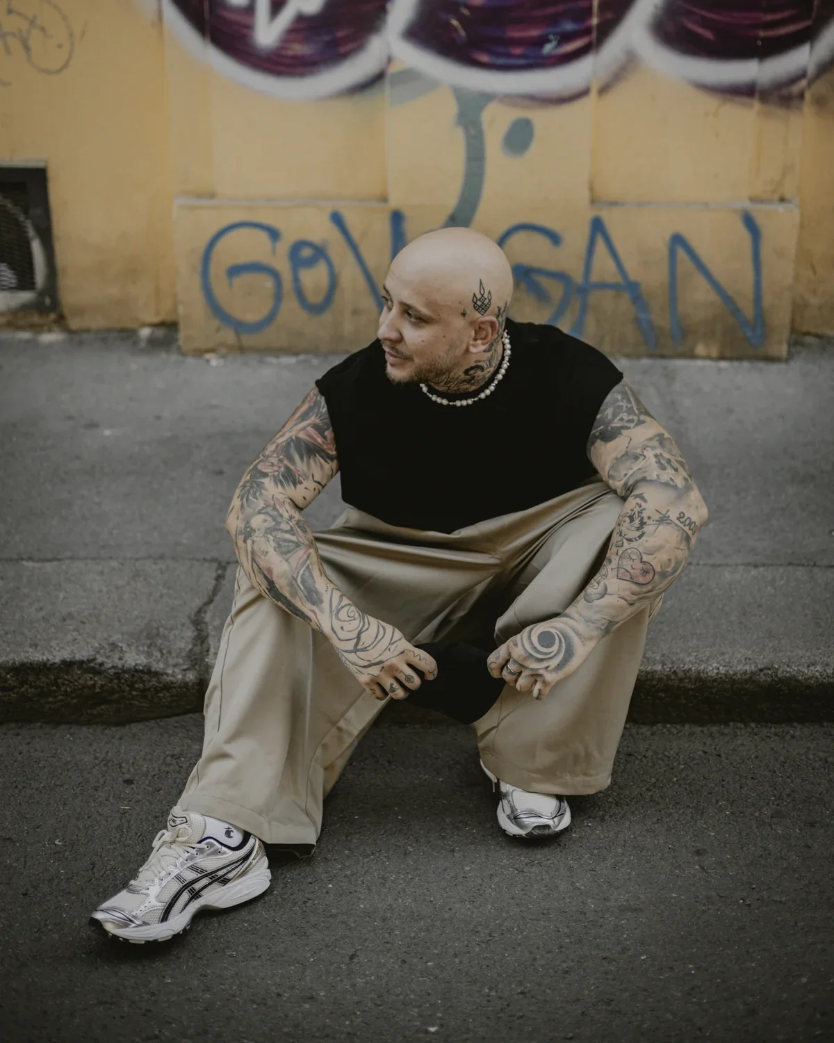
I bring order to visuals, for clients directly and as a silent teammate for agencies. My whole studio travels in a backpack, so my work isn't tied to any place. And the deadline? It knows no time zone here. It's sacred.
What clients value most
Flexibility. Speed. Creativity with zero warm-up.
Sound like someone you're looking for?
👋Let's talk

Collaborations / 03
Long-term collaborations
Agencies call me when they need a reliable extra head or pair of hands. Design that holds up to standards and deadlines, from creative and campaigns to execution and print.
MW Promotion
2022 – present
Design & Art Direction for clients like J&T Banka
I started as their in-house art director, today I deliver externally. My longest-running collaboration: J&T Banka, complete SILWER packaging visuals built from zero, ongoing campaigns, websites and tenders.
Addie.sk
2024 – present
Creative and campaigns for clients from gastro to development
NOUSOOS
2025 – present
Design & Identity for the studio I've been building from day one
Services / 04
I turn mess into a system
One brief or an entire brand. The result holds together and actually gets used.
Straight talk / 05
“A designer? ChatGPT does that for me these days.”
For an image, sure. For a brand, no. I use AI daily, so I know exactly what it can do and where it ends. And when you need structure, logic and a signature that doesn't fall apart on second use, you know where to find me.
Current focus
Testimonials / 06
People who come back for more
We've been working with Michal for years. Several of my colleagues, myself included. Quality, speed and reliability are the three main reasons our collaboration keeps repeating and is truly long-term.
The collaboration was excellent. Communication was fast, he handled everything willingly, and the results always matched what we agreed on in our consultations. We gladly recommend him and look forward to the next collaboration.
We agreed the collaboration would be iterative and that klobklob would create something original. That's exactly what happened. We were also pressed for time and Michal gladly accommodated us, which helped a lot. Looking forward to the next one.
A very pleasant collaboration right from the start. We handled briefs as they came, without needless explaining, and he always responded to our requests willingly. The result convinced us we chose right. We'll gladly work together again in the future.

Working with Michal is on a very high level. Communication, inventiveness, adaptability. Every one of these was delivered at 100%. Highly recommend!
Clients / 07
Brands that passed through my hands
Client: Barrique · Year: 2026
Barrique
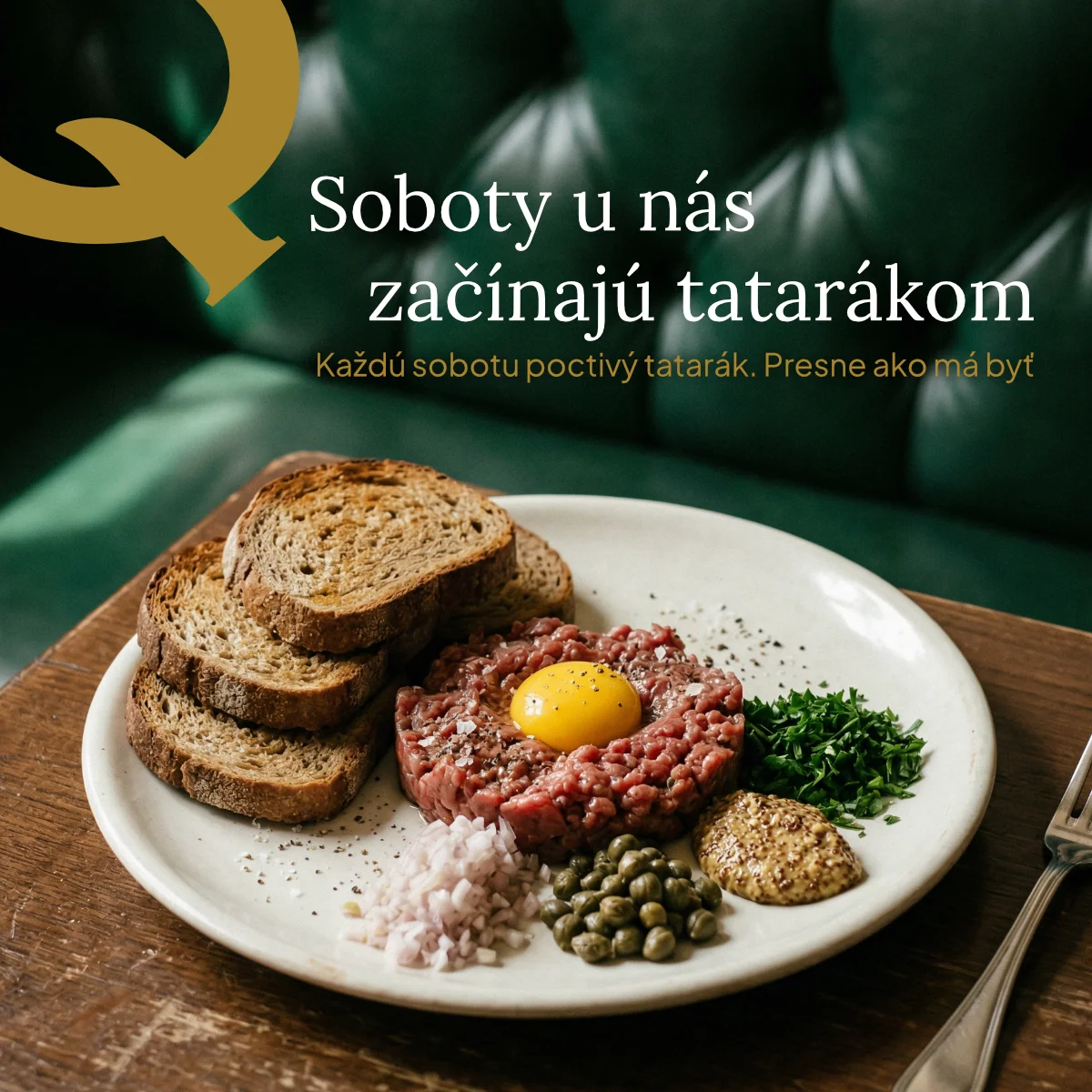
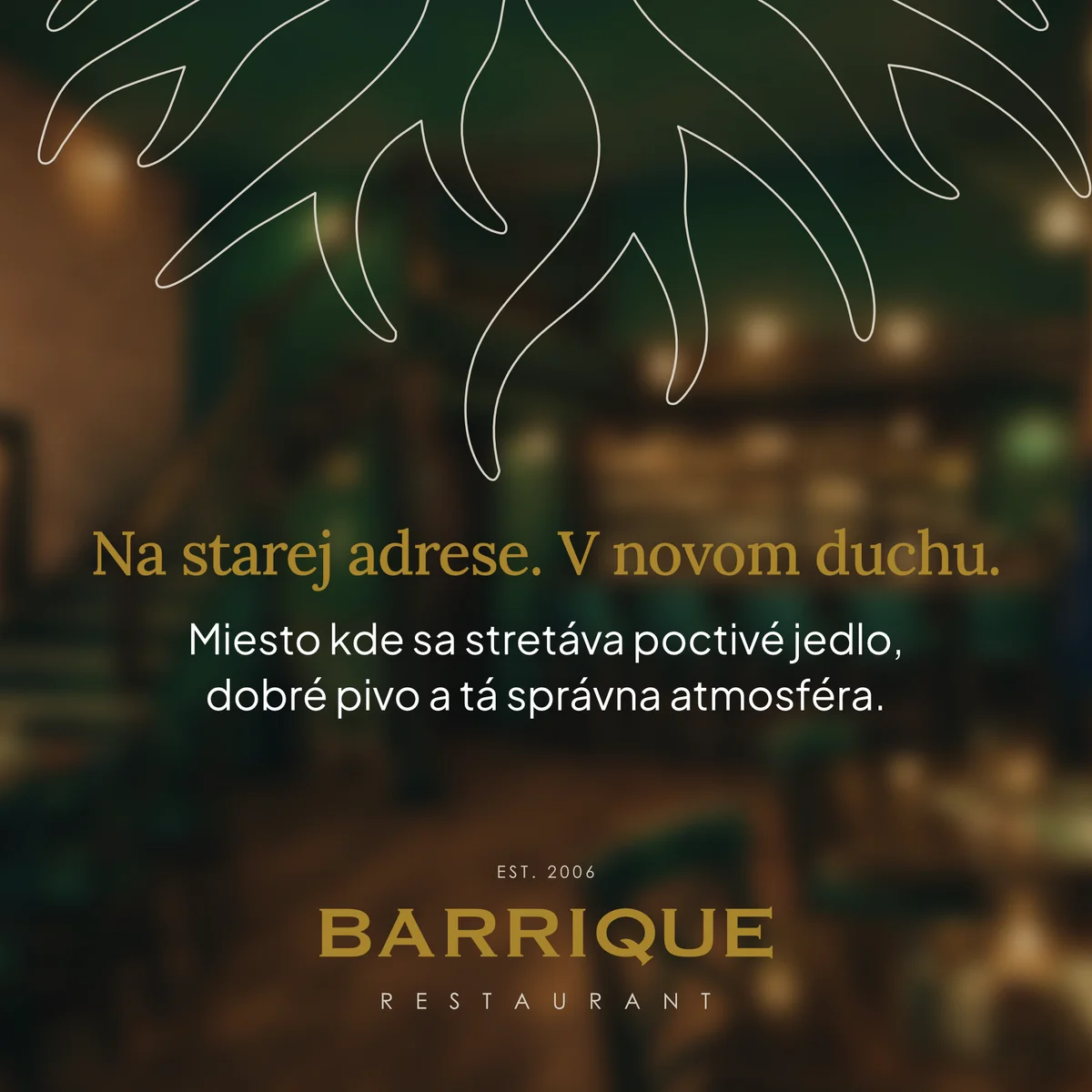
Barrique is a restaurant and bar at a well-known address in Žilina. The venue is going through a complete transformation: new concept, new kitchen, its own sourdough bread. The identity had to do the same, start from scratch, but in a way that it would still be Barrique.
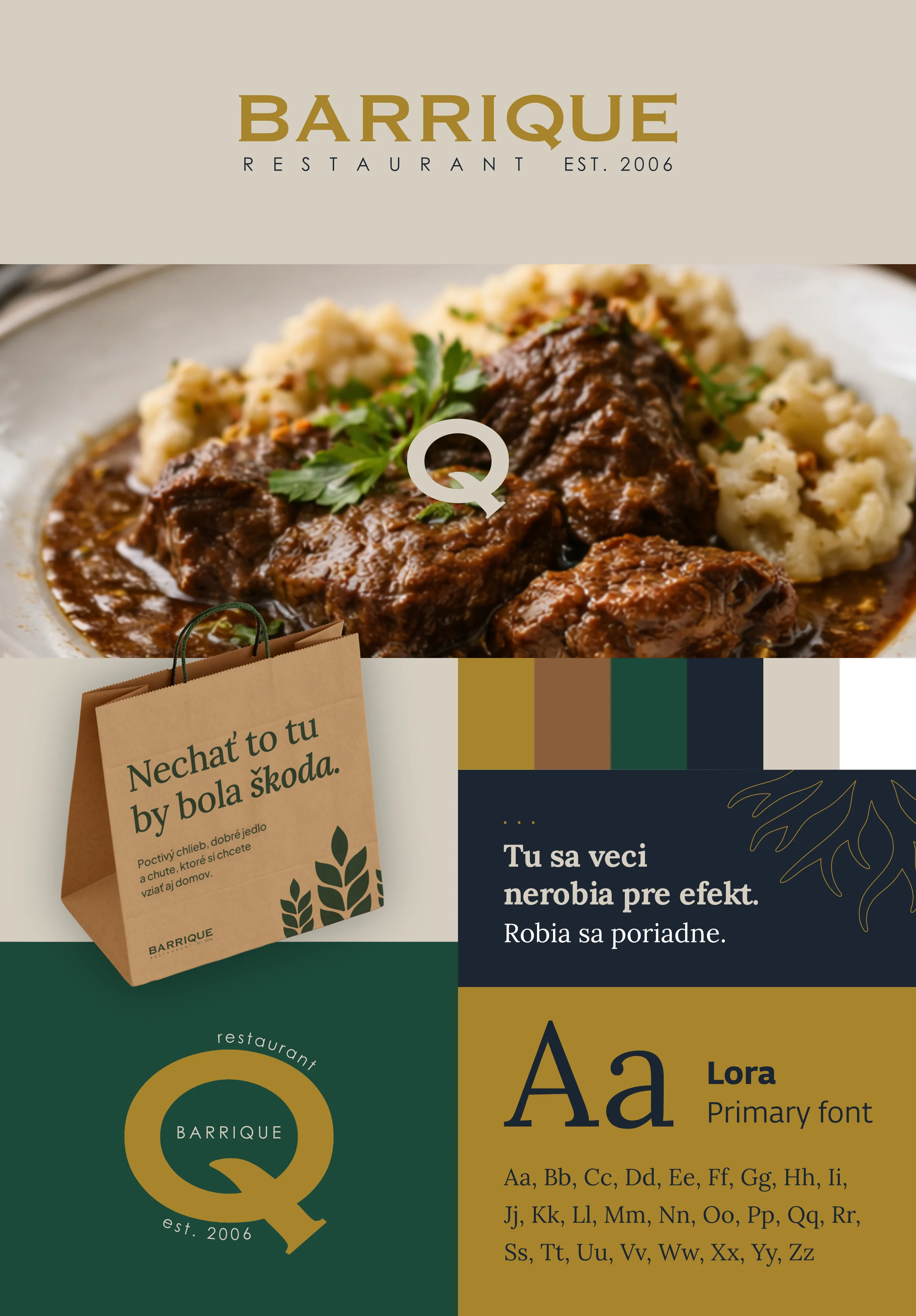
Grain — harvest / bread / craft
Symbolizes the harvest, the foundation of ingredients and bread as a natural part of the table. In the context of the brand it points to craft, honesty and baking your own bread.
Roots — origin / stability / continuity
Represent origin, stability and firm anchoring in a place. They point to locality, continuity and the natural base the brand grows from.
River — flow / nature / region
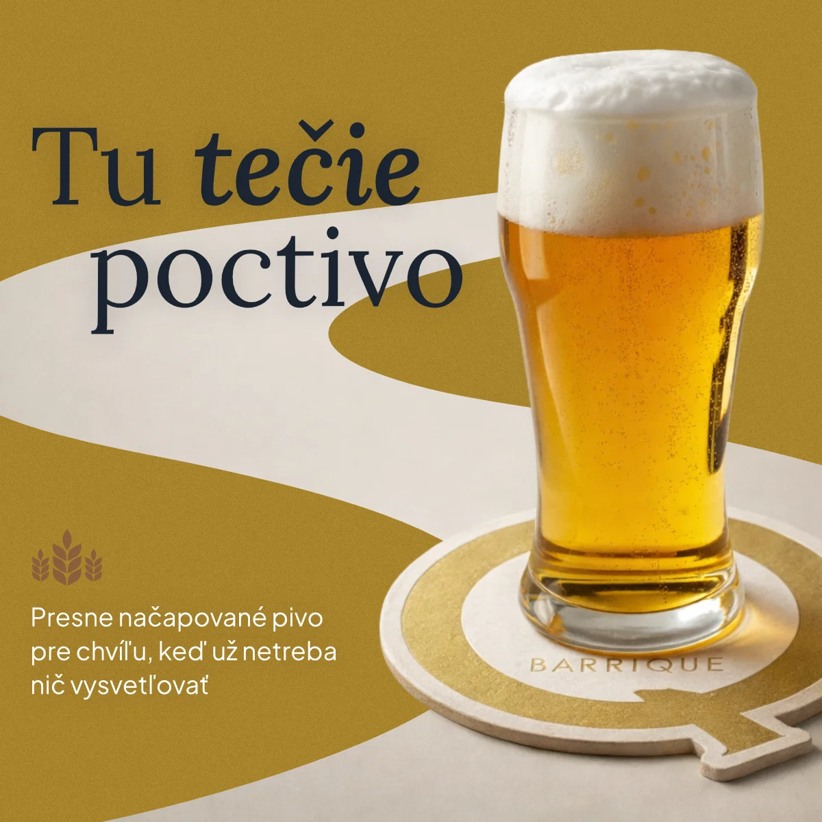
The river symbolizes the natural flow of the landscape and of life. In the identity it brings movement, fluidity and a subtle nod to the region the brand comes from.
The identity grows out of the northern landscape. Three symbols carry the whole system: grain as harvest and craft, roots as origin and stability, the river as flow and region. No folklore, no nostalgia. The colors are pulled from the ingredients and the surroundings, the typography pairs a serif with character and a clean sans for everyday work.
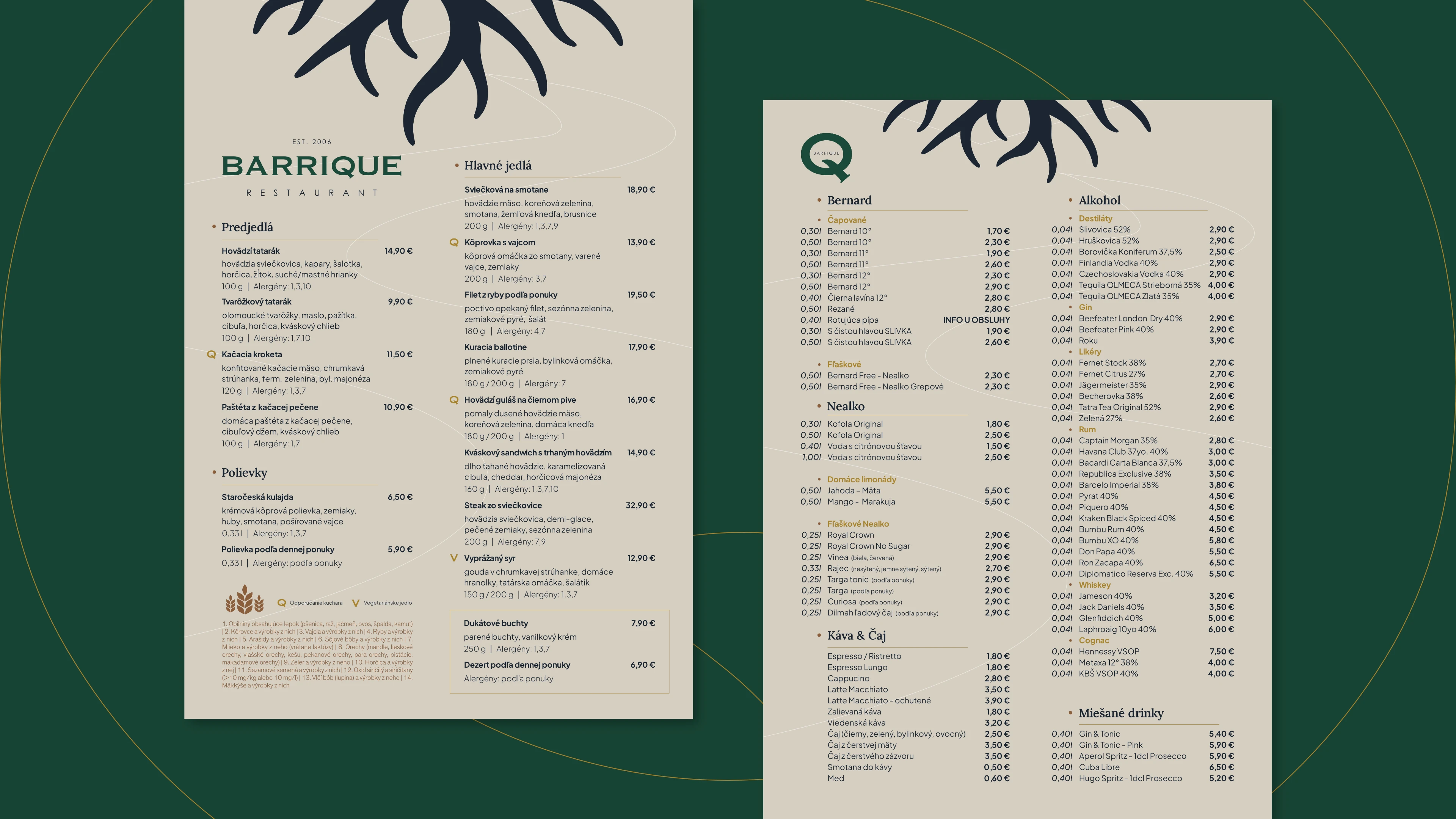
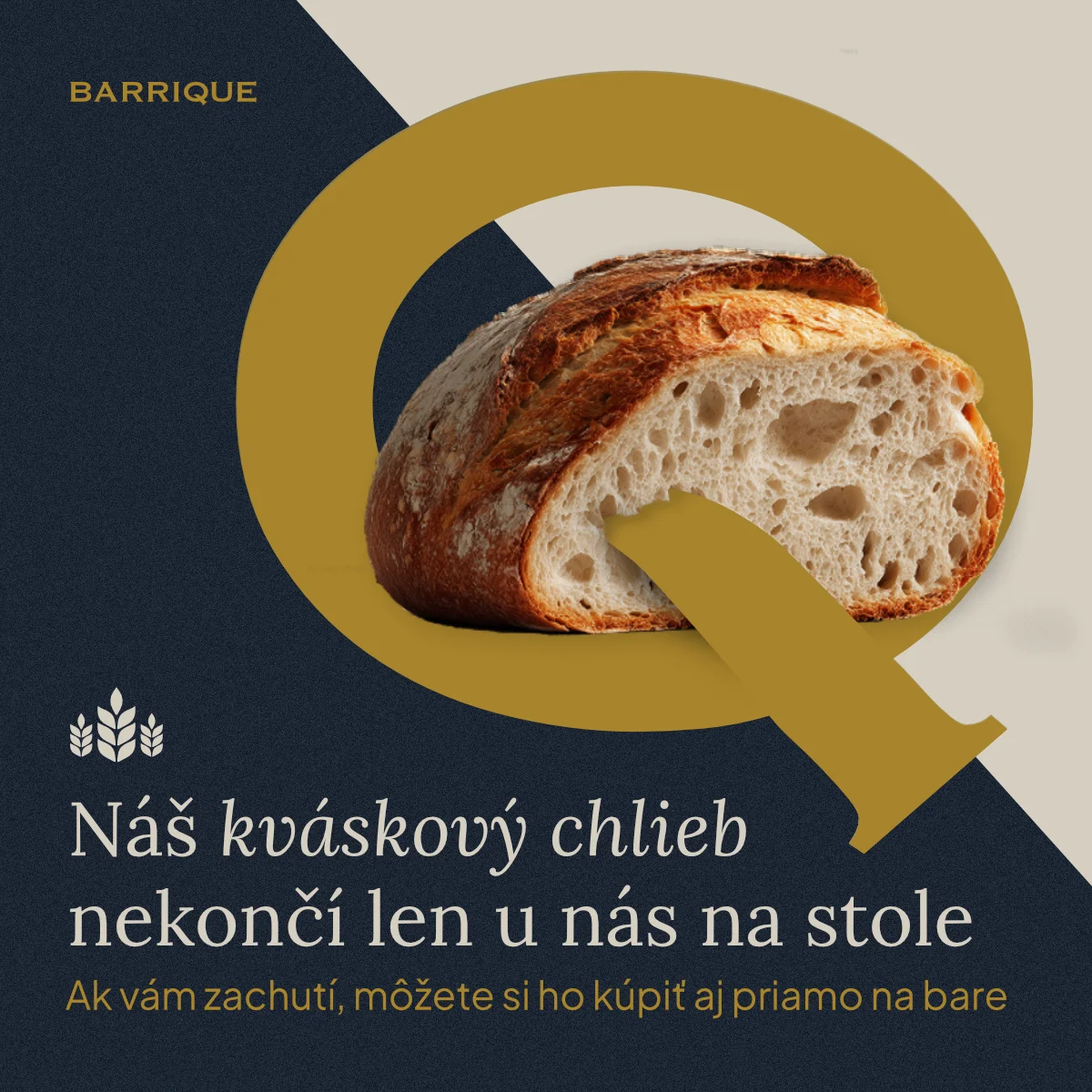
One concept grew into an entire brand world: logo system, brand manual, food and drink menus, social media communication and brand applications from coasters to citylights. The website is on its way. Everything carries one handwriting.
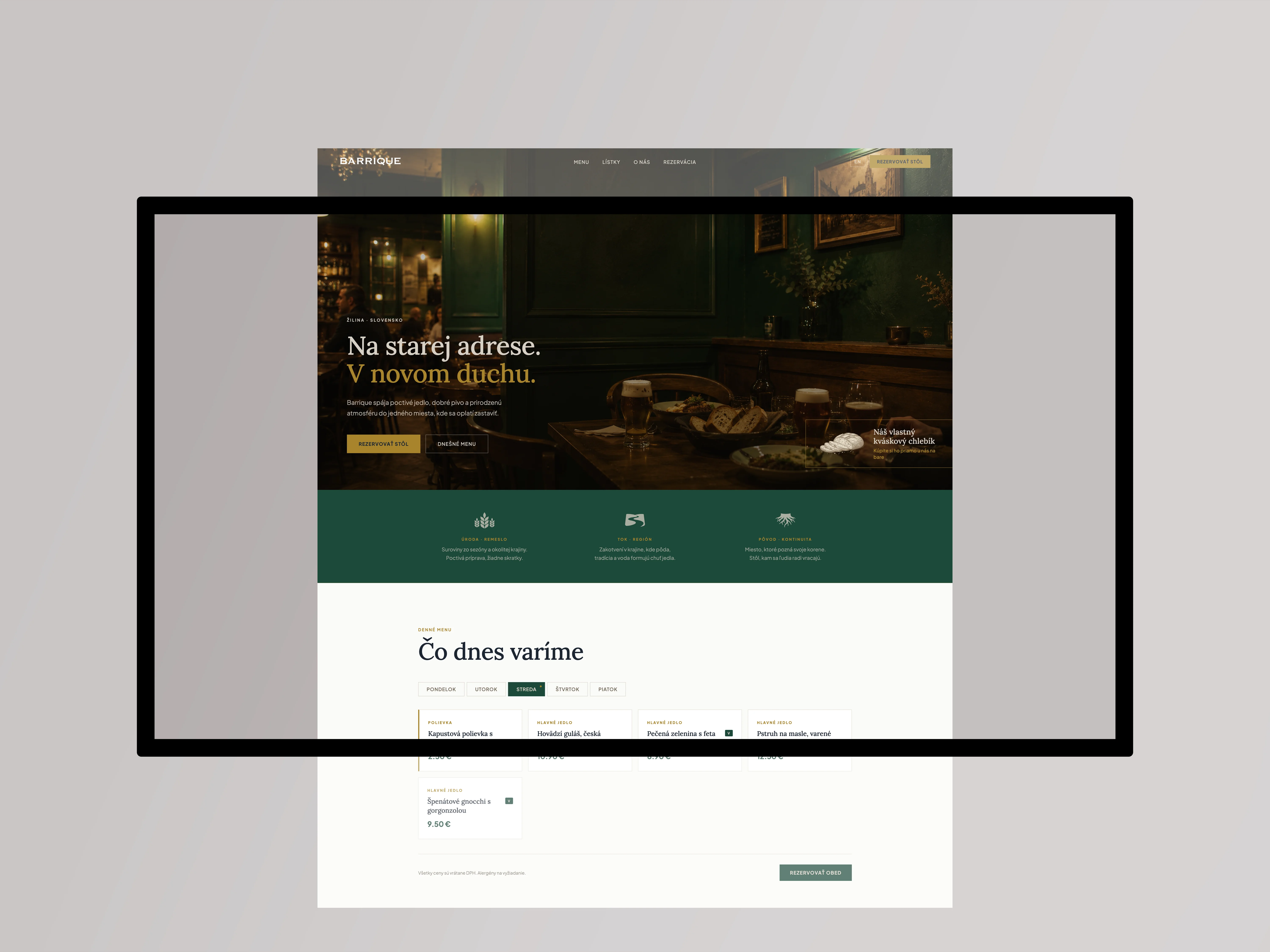
Brand/Web goes live in August 2026